Những điều bạn cần biết về phân tích dữ liệu trong SAP Business One (Phần 3)
Design and delivery - balancing between storytelling and deeper data diving
Some applications and sites are a pleasure to use and you can spend hours “noodling” around enjoying the experience.
Its obvious that the entire user experience or UX has been carefully crafted and there has been lots of research in to what the best way is to design the app, site or content.
Unfortunately, the same can't always be said for the average BI dashboard…right?
However a lot of the beauty is in the eye of the beholder based on what they want to get from the dashboard...let me explain a bit more what I mean.
The Power of Storytelling…at the right time with the right audience
These days you’ll hear a lot about the importance of storytelling and using the numbers from your ERP in a carefully crafted set of data-based presentations that lead the intended audience on a journey to an outcome – usually a decision is required about a change in strategy or tactics where the justification for the change has been carefully laid out in the preceding dashboards, graphs and visualizations.
When communicating to a large audience that is interested in the topic and the outcomes these tools can be invaluable particularly when you need to keep people with short attention spans engaged.
But if you aren’t a UX expert or data scientist, how can you built those sort of visualizations with your data – you know, the same ones the sales person showed you hooked in to a carefully constructed data set that enables them to show you the power of their particular toolset?
Rapid Decision Making – the domain of the small and midsized business

Malcolm Gladwell wrote a book called Blink that posed the question of what is more important, knowledge/experience/intuition or data and provided examples of both winning in certain situations and others where you needed a balance between the two.
Personally, I am a believer in the power of intuition or knowledge based experience confirmed with data – in fast paced environments where the people have been in the business or industry for a long time this leads to better decision making – done faster.
Having worked in some of the largest companies in the world and now running my own small business I can confirm that this is a winning strategy.
Get the high-level data quickly and drill down to the core information when you need more details otherwise you quickly fall victim to one of two different outcomes – analysis paralysis or missed opportunity.
The BI Dilemma
Unfortunately, many BI tools only fit in to one or the other of these categories. Even the analytics provided with SAP Business One version for HANA can fall victim to this challenge.
You can get the high-level numbers and they are charted and graphed but unfortunately the drill down capabilities aren’t there.
It’s the same for many of the solutions that offer the ability to connect directly to the underlying data set rather than providing a data extraction at the transaction level so that you can drill back to the base transaction.
Obviously, nirvana is a full drill down link to the underlying transactions in the ERP but that requires the analytics user to have a license to the ERP software as well.
The best solution depends on the outcome you want
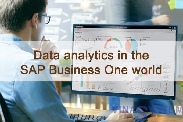
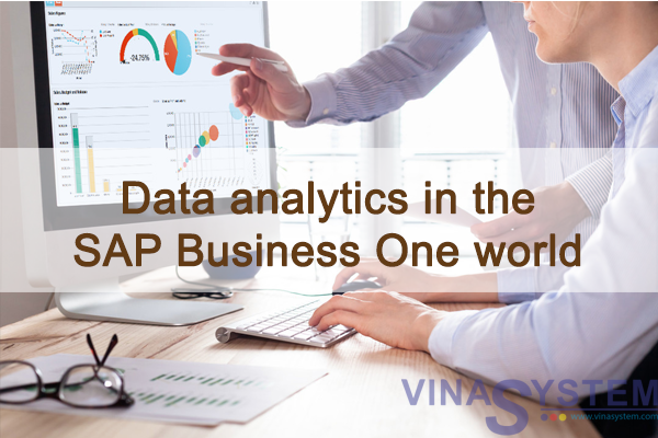
So what should you choose – the cool visualization designer like Power BI or SAP Lumira or the more functional multipurpose toolset like Phocas or BI 360?
If you are looking for a storytelling and visualization tool then I am inclined to give my vote to Power BI whereas for a multipurpose solution that will give you visualization and reporting with a data warehouse/semantic layer that allows drill down then Phocas or a similar toolset will be a better fit.
Source: Richard Duffy | CEO and Founder at SMB Cloud Solutions - Brewing and Distillery Technology Solutions


